Link to Tehama Website
I joined the Pythian Group (Tehama Platform) in Feb 2017 as a UX/UI designer.
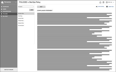
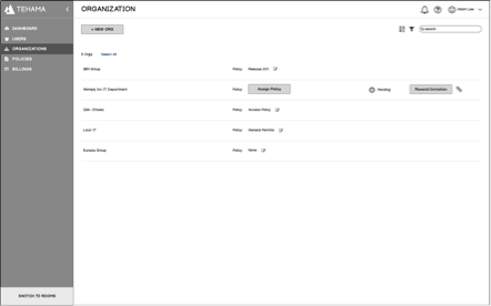
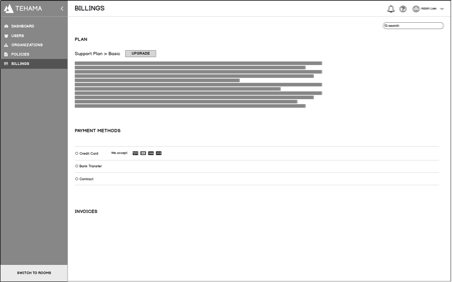
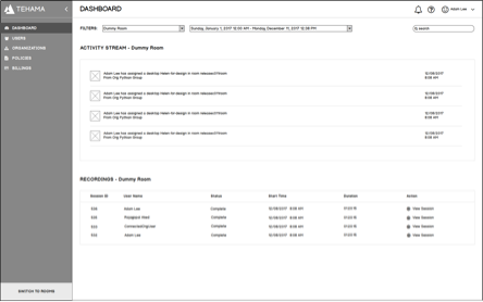
In the earlier stage, I was tasked to review and design new features and product requirements following the consistency of the existing platform.
I have been redesigning the platform from research of the existing platform problems discovery and analysis to interaction design delivery through a completed design process since Fall, 2017.
Tehama is an awesome remote workforce that easily onboard and connect remote, internal and third party teams around the world and empower them to deliver the work that drives transformation forward.
The V 1.0 redesign effort is taking a thoughtful, user-centric approach to product design. This is not just a creative process rather a comprehensive UX design exercise incorporating an understanding of competition, data analysis, user feedback, IA design, experimentation, and curation of material and concepts to product a refined product experience.
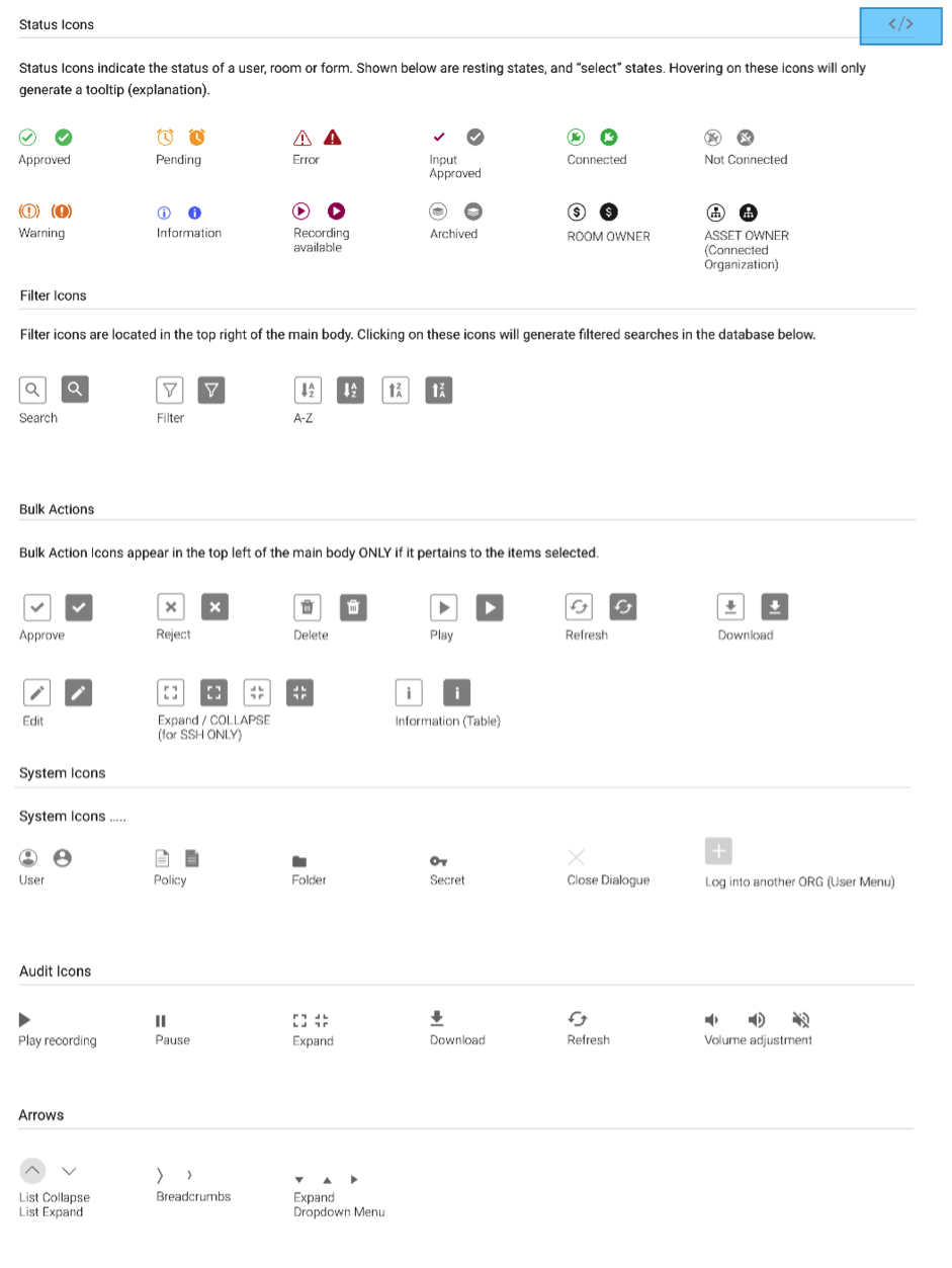
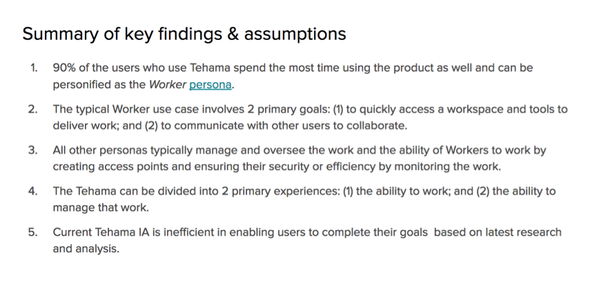
Critical findings in UX/UI from research:
Understanding of users was not enough
Too much noise for workers in the UI
Some tasks took too many steps to be finished
Some of workflows were confusing
Some features design solution were not scalable
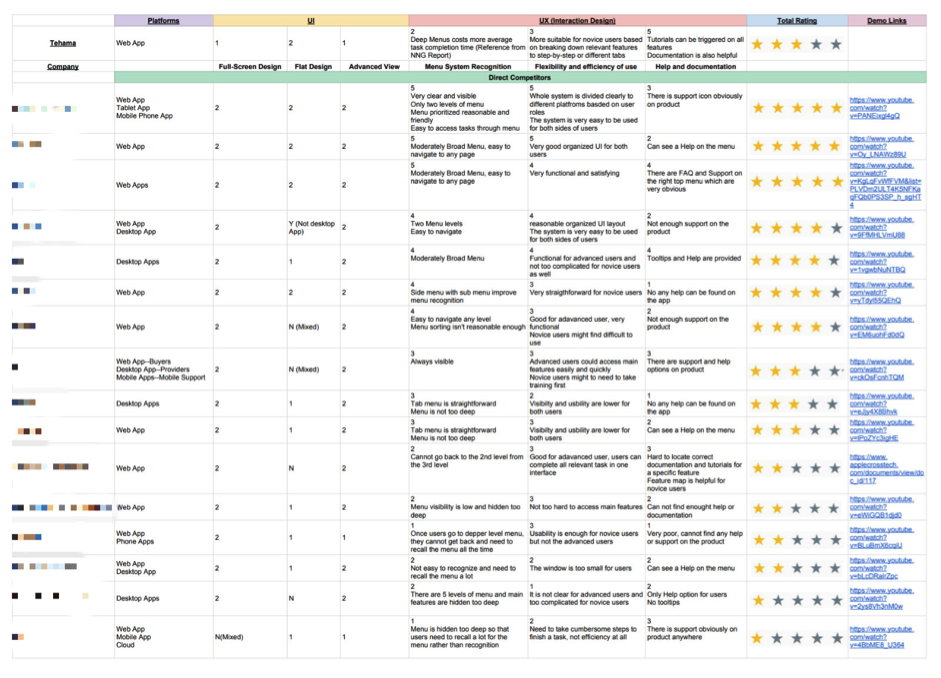
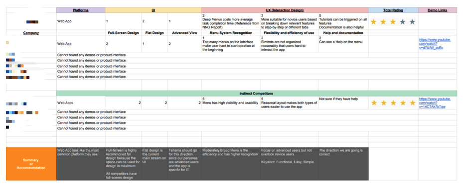
Web Apps look like the most common platform they use
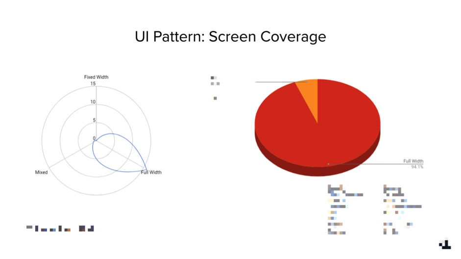
Full-Screen is highly recommended for design because the space can be used for design in maximum
All competitors have full-screen design.
Flat design is the current main stream on UI.
Tehama should go for this direction since our personas are advanced users and the app is specific for IT.
Moderately Broad Menu is the efficiency and has higher recognition.
Focus on advanced users but not overlook novice users.
Keyword: Scalable, Easy, Simple.
The direction we are going is correct.
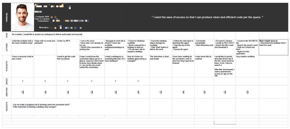
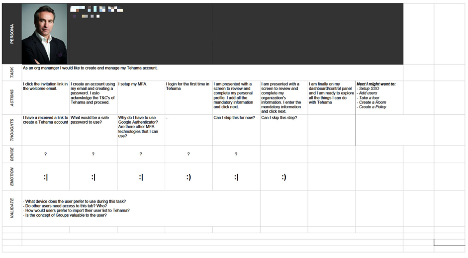
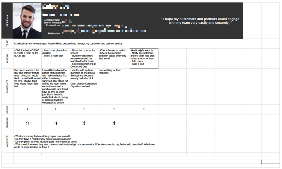
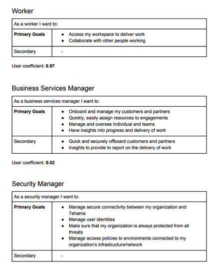
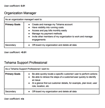
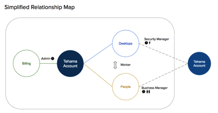
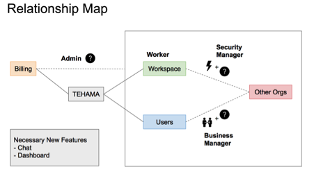
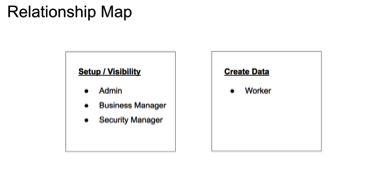
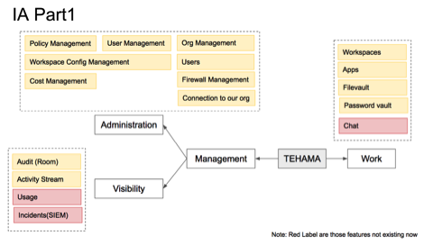
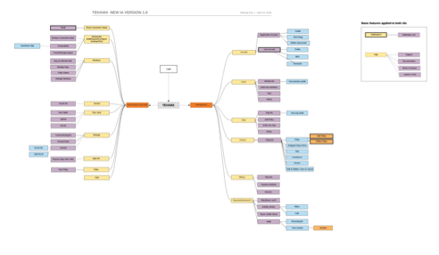
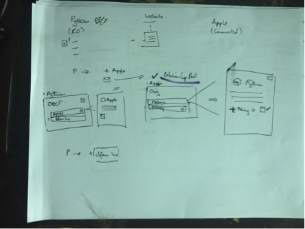
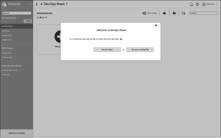
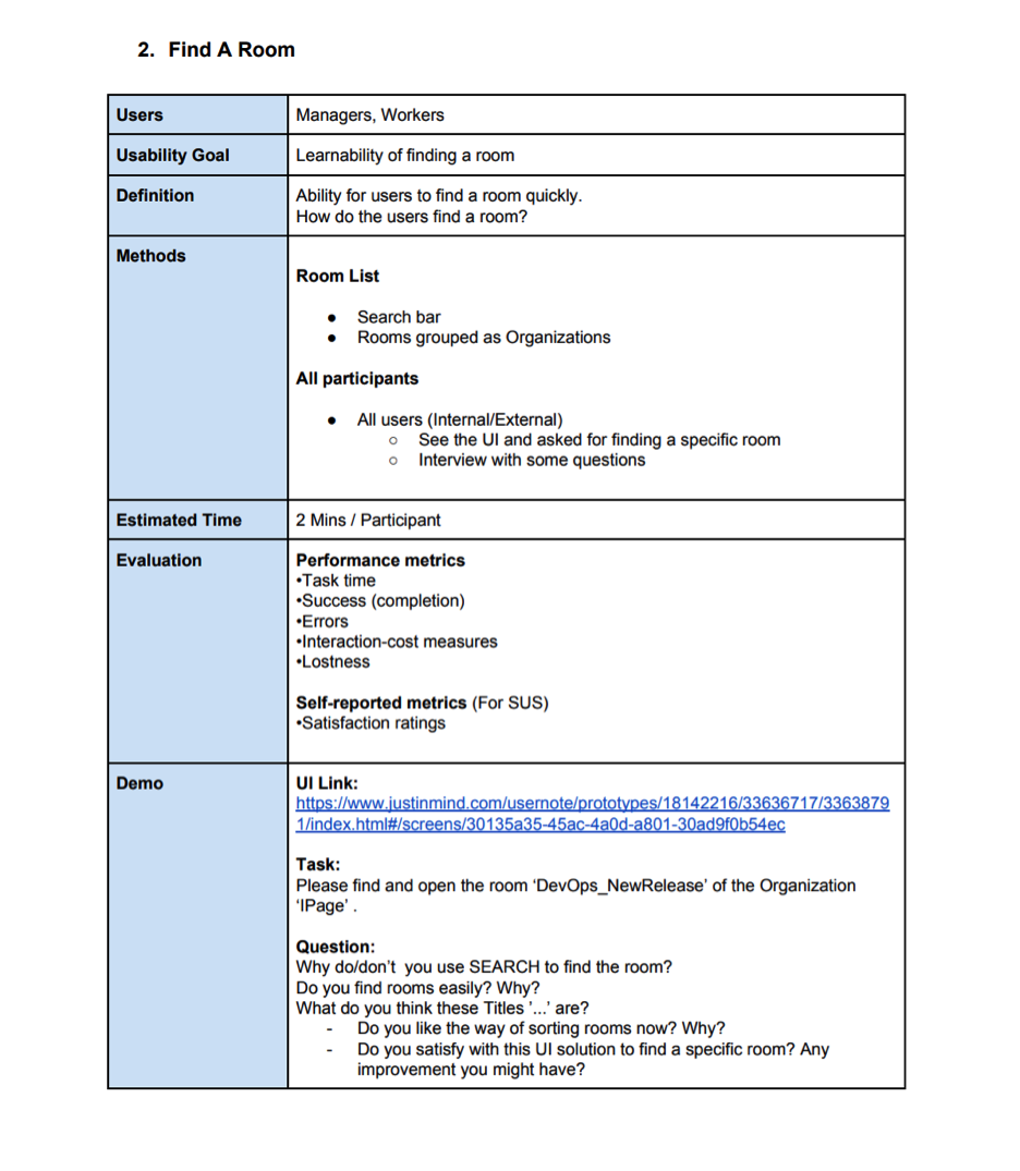
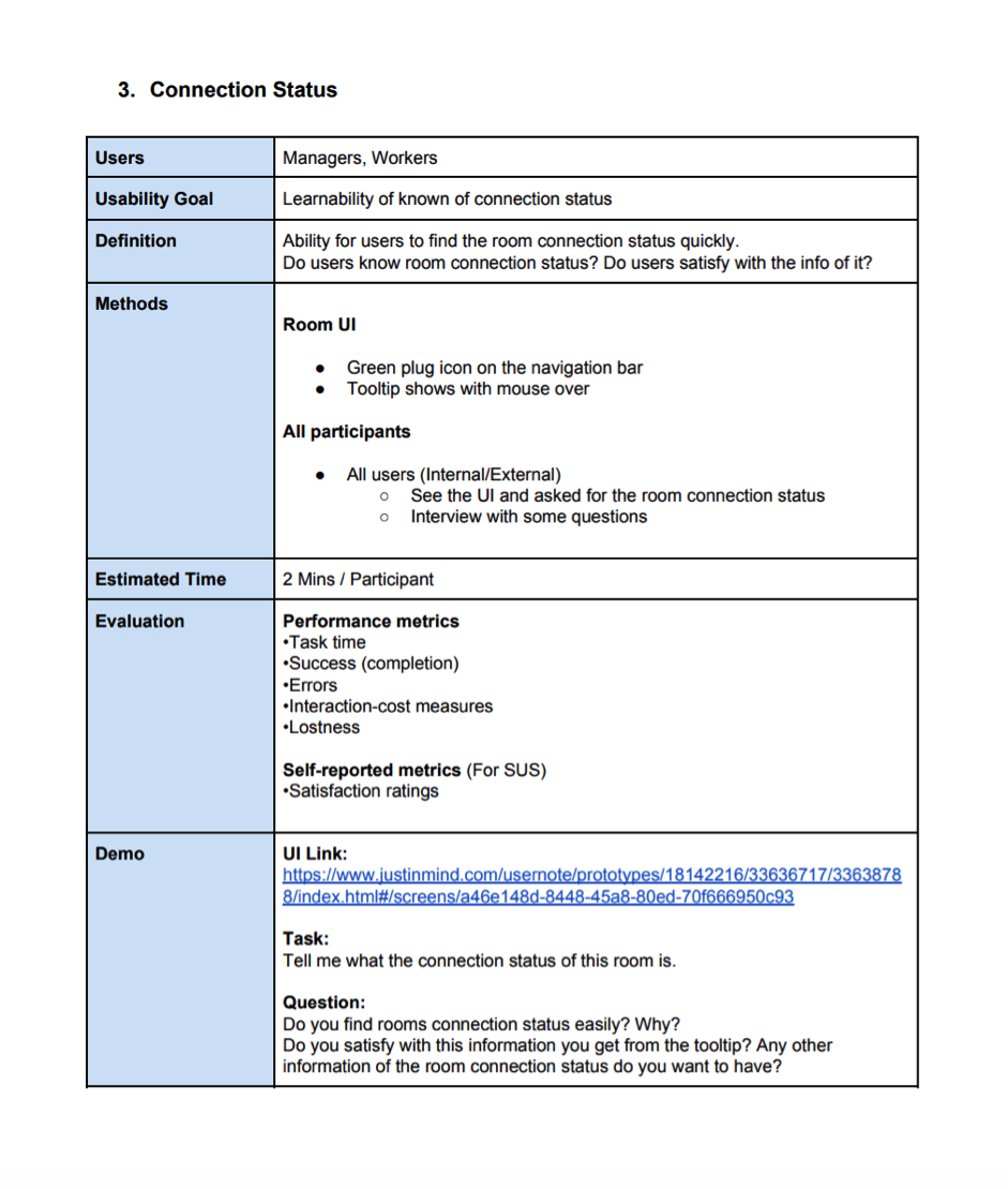
Defining a proper Information Architecture was essential and extremely important in the design process, which determines the product design direction. Users might get confused on the product workflow if the IA wasn’t built up well. Moveover, interaction design could have many possibilities with various HCI principles based on the IA.
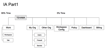
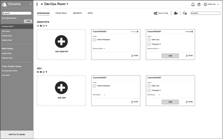
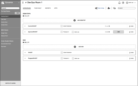
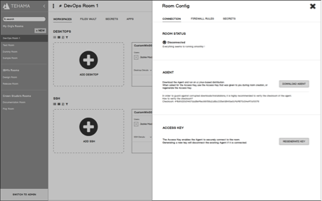
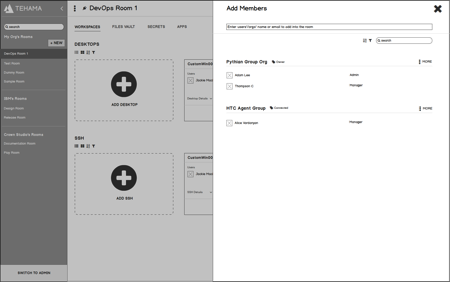
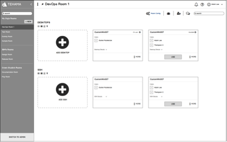
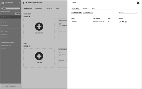
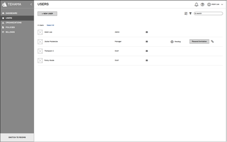
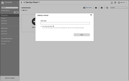
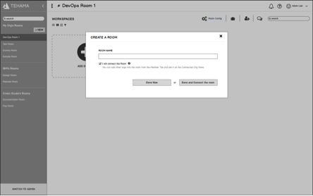
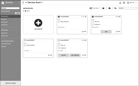
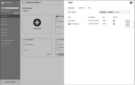
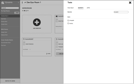
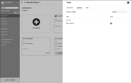
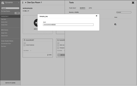
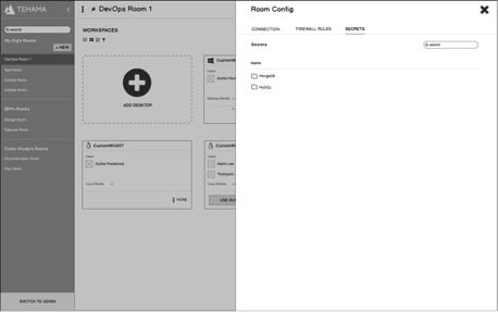
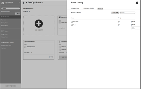

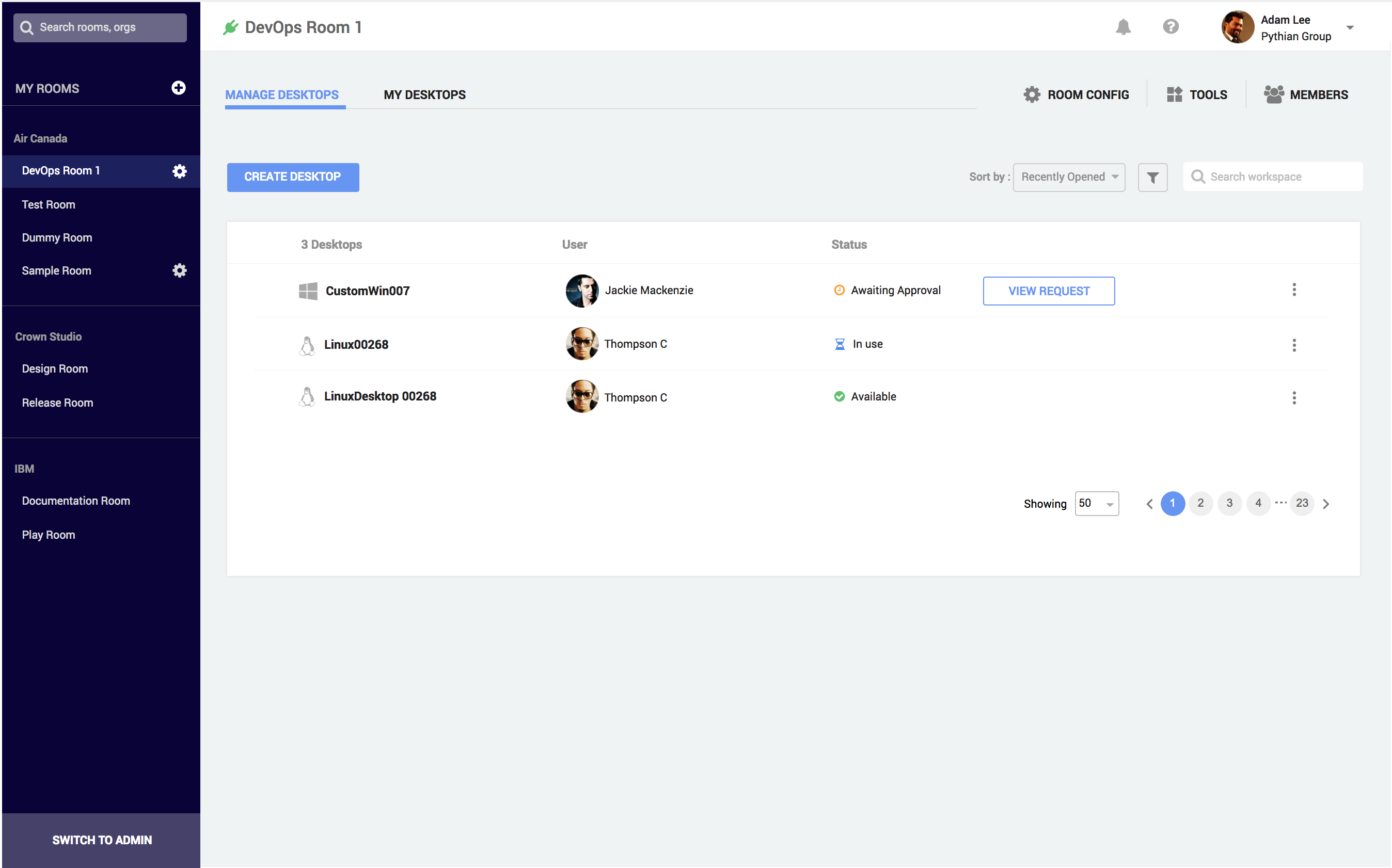
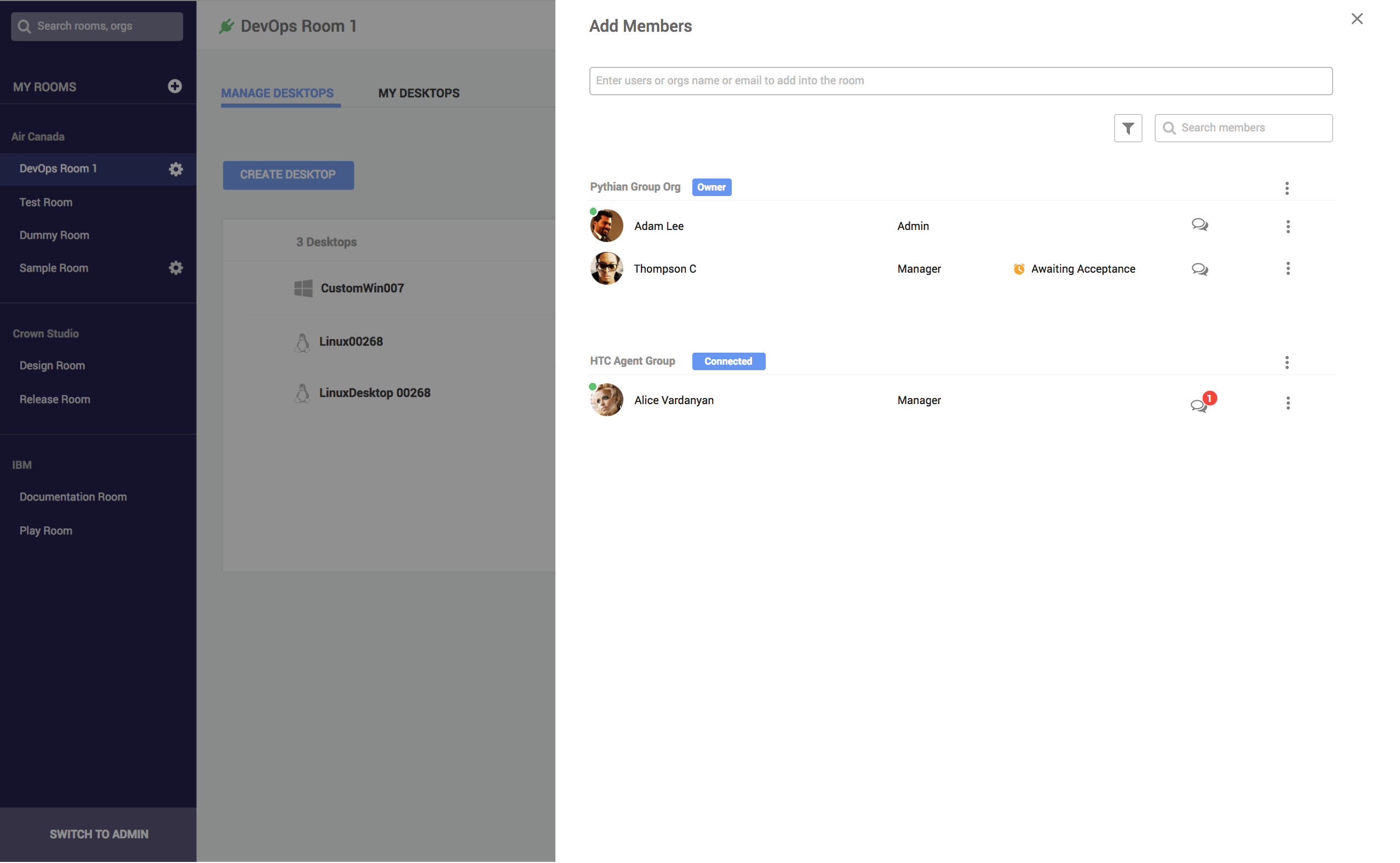
New design separates two differnt UIs for two type of users, which reduced more interaction cost for worker users compared to current version
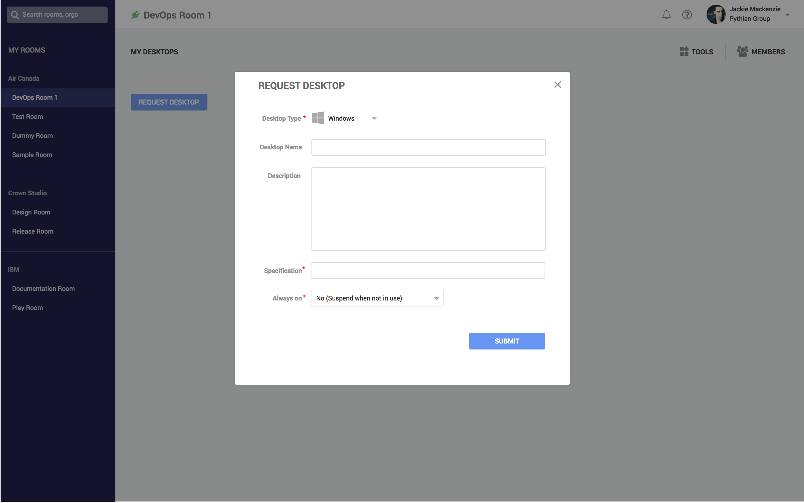
Set up user tasks hierarchy on platform, which makes users complete tasks easier and quicker
Use more scalable layout design patterns new design to make the platform be easier to maintain in the future
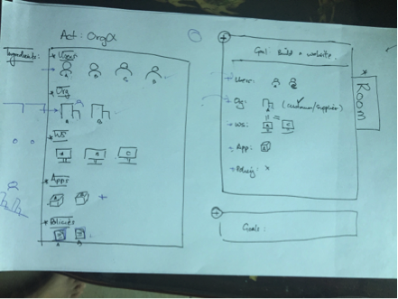
Workflow helped us to walk through design feature to make sure our design solutions to be fitted user model.
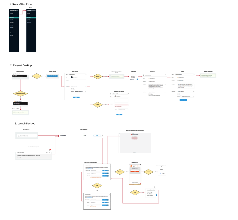
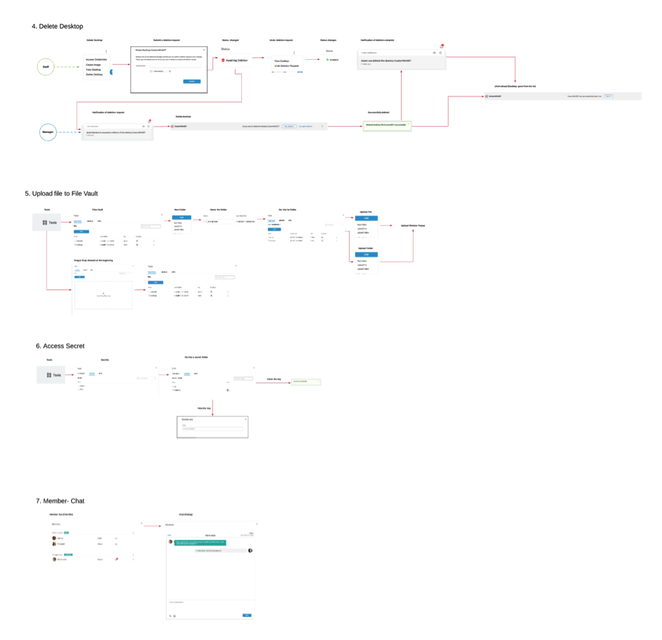
Created the interaction design solution with proper UI patterns following HCI principles, which makes design solution are more successful during usability testing.


Usability testing helped us to find design errors and make design solution better.
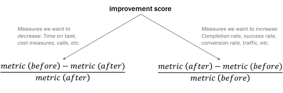
Formula reference and more on improvement scores:
https://www.nngroup.com/articles/improvement-score/